Artscape — Toronto Art Community App
From Discovery
to Belonging
A discovery-and-community platform for Toronto's art lovers, artists, and galleries — as easy to find a ceramics workshop or an emerging painter as a restaurant on Yelp.
The Problem
Toronto's art scene is everywhere, and nowhere at once
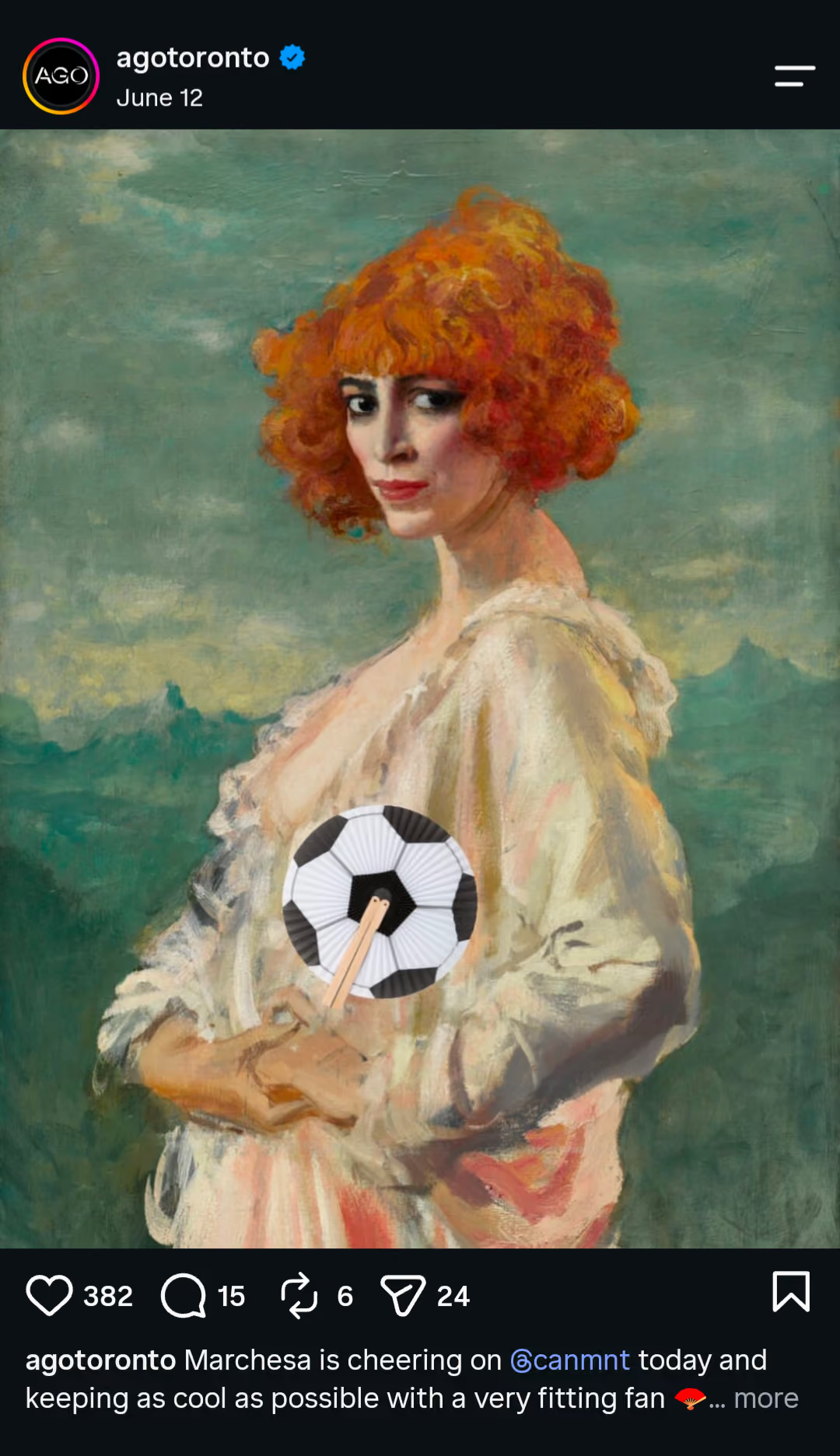
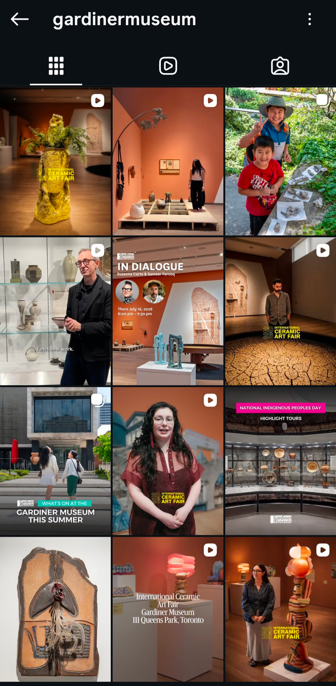
Ask three different people how they find art in this city and you'll get three different apps, none of which talk to each other. Instagram surfaces the aesthetic. Eventbrite surfaces the ticket. Google surfaces whatever paid to rank. None of them surface a place to belong.
 Instagram
 Instagram
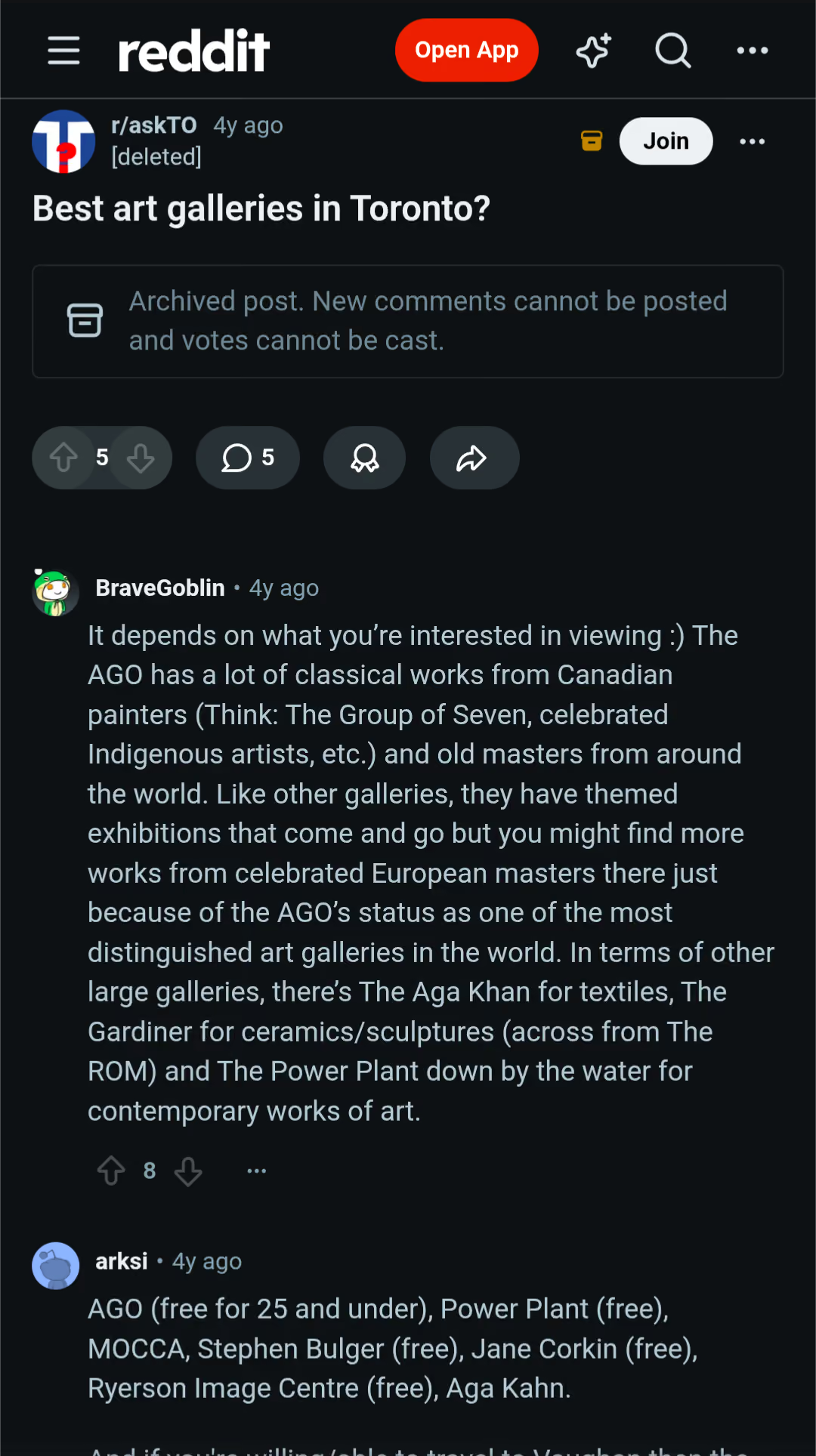 Reddit
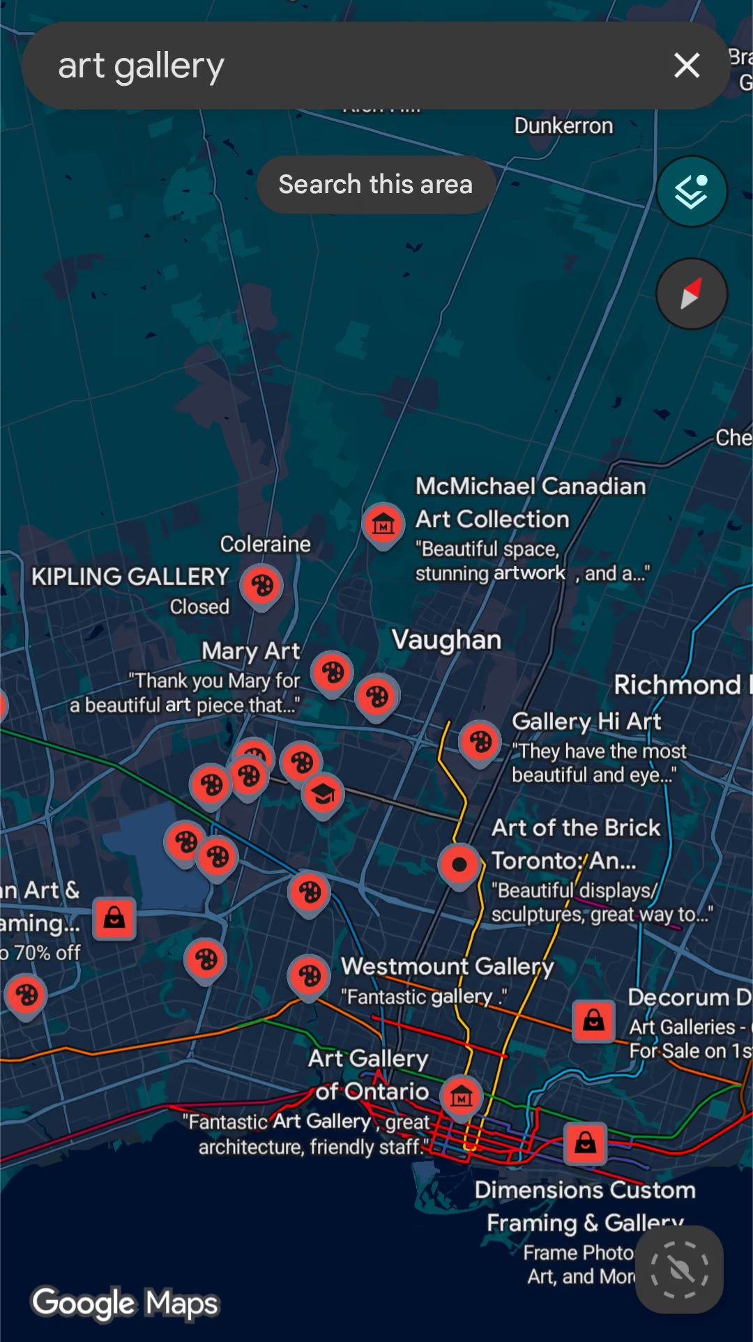 Google Maps
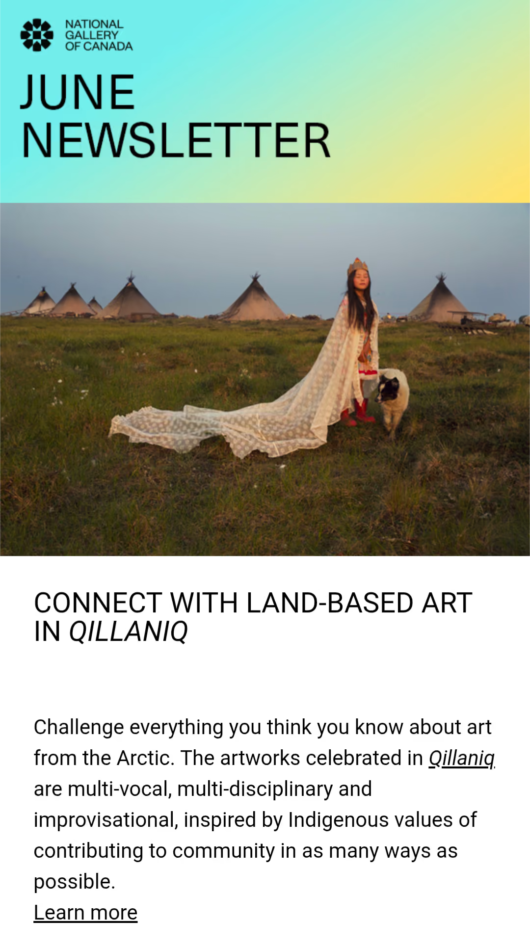 Email
Email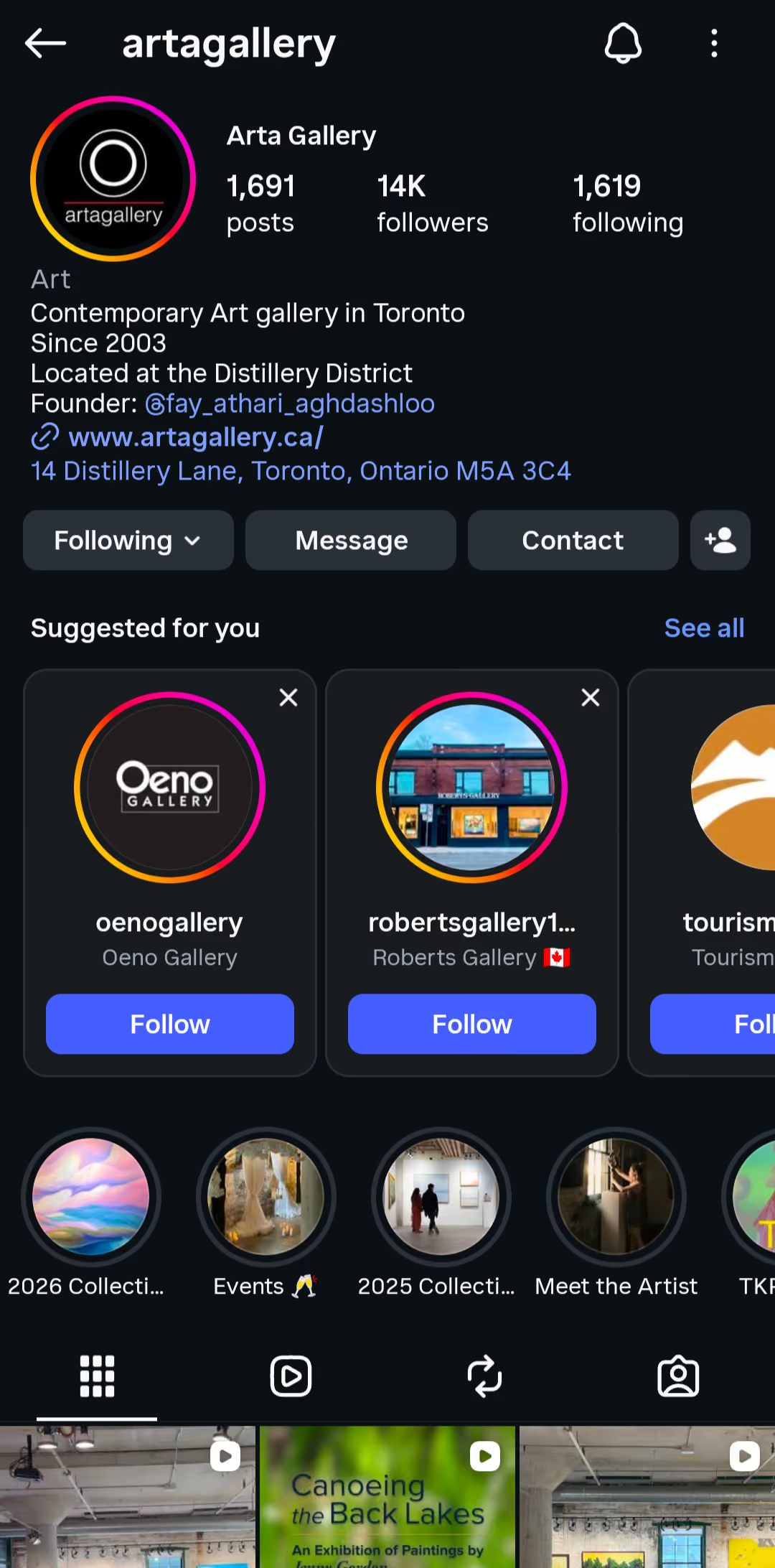 Instagram
When Mark lands in an unfamiliar city with only a few days to shoot, he wants a source he can trust to point him past the tourist spots, so he can capture something real, not staged.
Pain point: No reliable way to separate authentic finds from tourist traps, with limited time to research.
When Olivia finds a studio whose work excites her, she wants an easy way to reach out and build something with them, so a moment of inspiration doesn't just end at a nice photo.
Pain point: No easy way to connect or collaborate with the local creatives she discovers.
When Alessandro's gallery goes a season without new visitors, he wants visibility without fighting big galleries' budgets, so word of mouth has somewhere to actually travel.
Pain point: No time to build an online presence, and barely any reviews to be found by new visitors.
The Product
The bet, made real
Each objective from the strategy shows up as a real flow in the app. Here is Artscape delivering on all three, one chapter at a time.
From a nearby feed to the front door
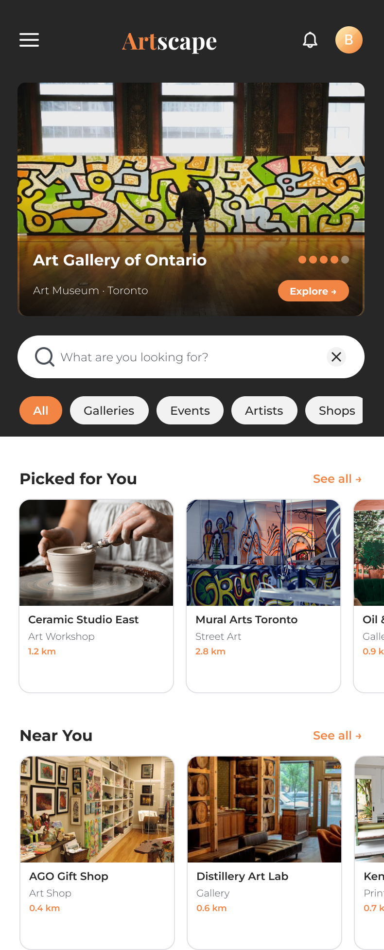
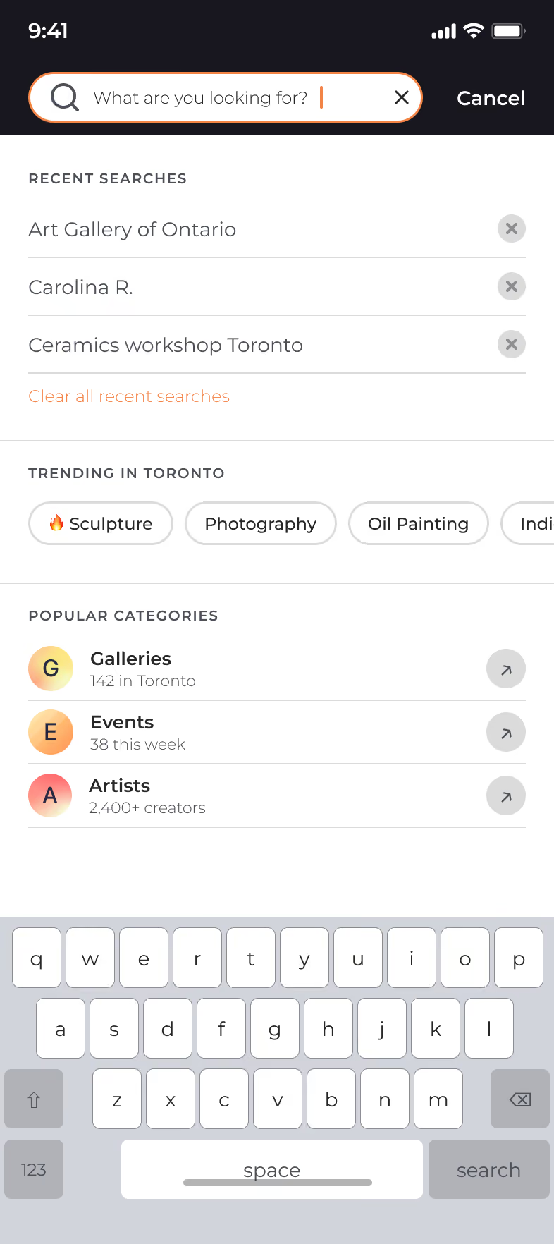
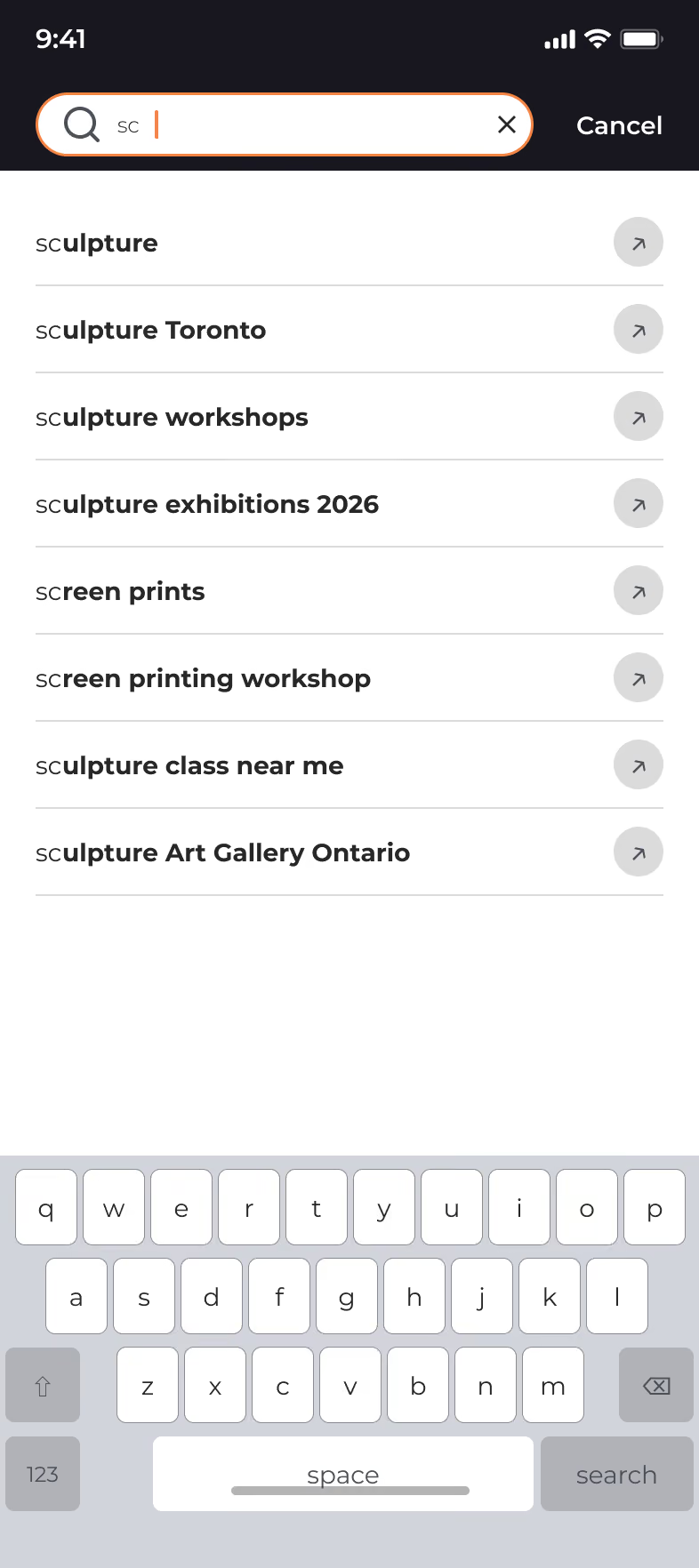
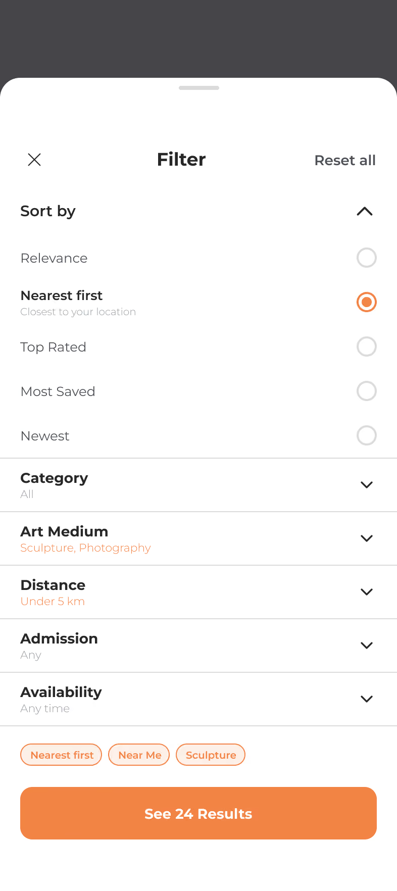
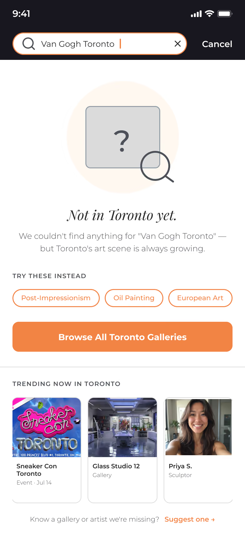
Discovery starts on Home, a nearby feed of galleries, workshops, and events. Search narrows it through five states that never leave a user stuck: empty, autocomplete, results, no-results, and filtered. And every listing carries its real coordinates, so what you find on screen always points to a door you can walk to.
Design decision: every event and gallery leads with its physical details, distance, address, and Get Directions, so a digital discovery always resolves to a real place in Toronto. The strategy's bridge, made literal.
%20(3).avif)
.avif)
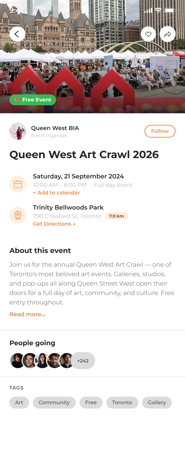
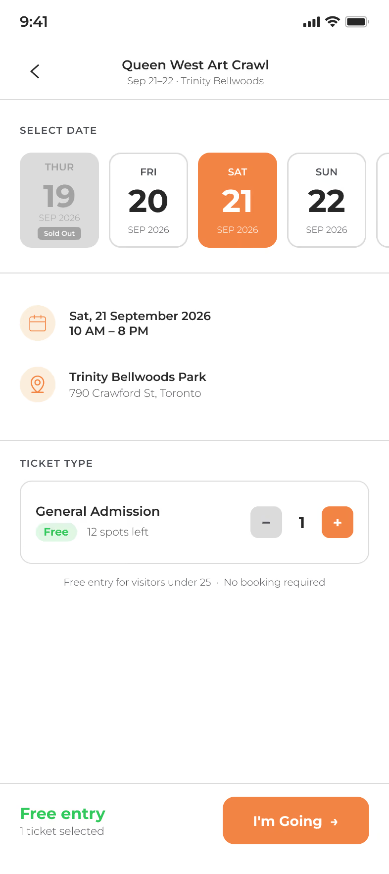
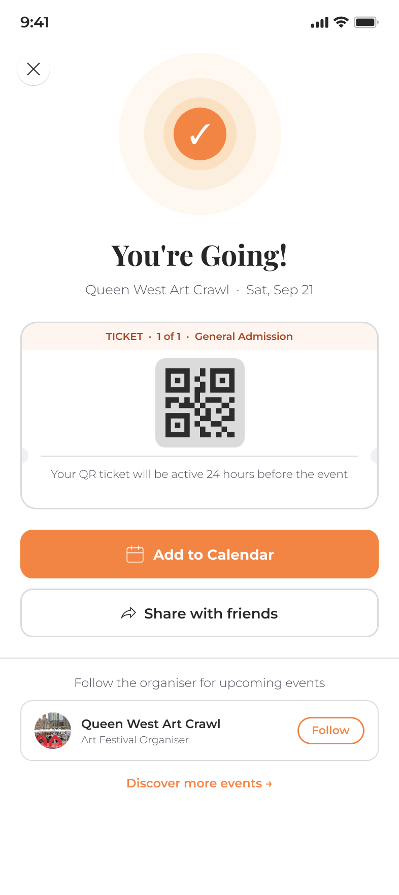
From event details to a confirmed digital ticket, the whole RSVP happens without leaving Artscape, so the moment of interest never cools off while hunting for a booking link.

Every listing, deep enough to decide from
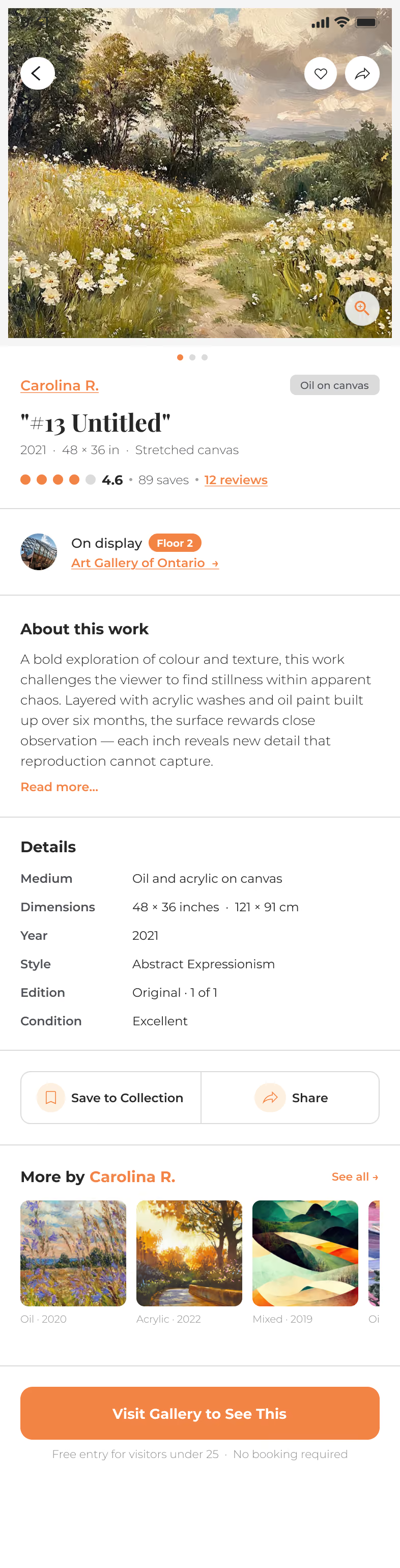
A gallery, an artwork, or an artist, each opens into a full page rather than a thin card. Everything a user needs to decide to go lives in one place, with no extra tabs and no dead ends back to Google.
Design decision: every listing opens as a full page, not a card, so descriptions, images, hours, directions, artist bios, and related works all live in one place. A user can decide to go without leaving Artscape or opening five tabs.

%20(3).avif)
Two sides of the same community
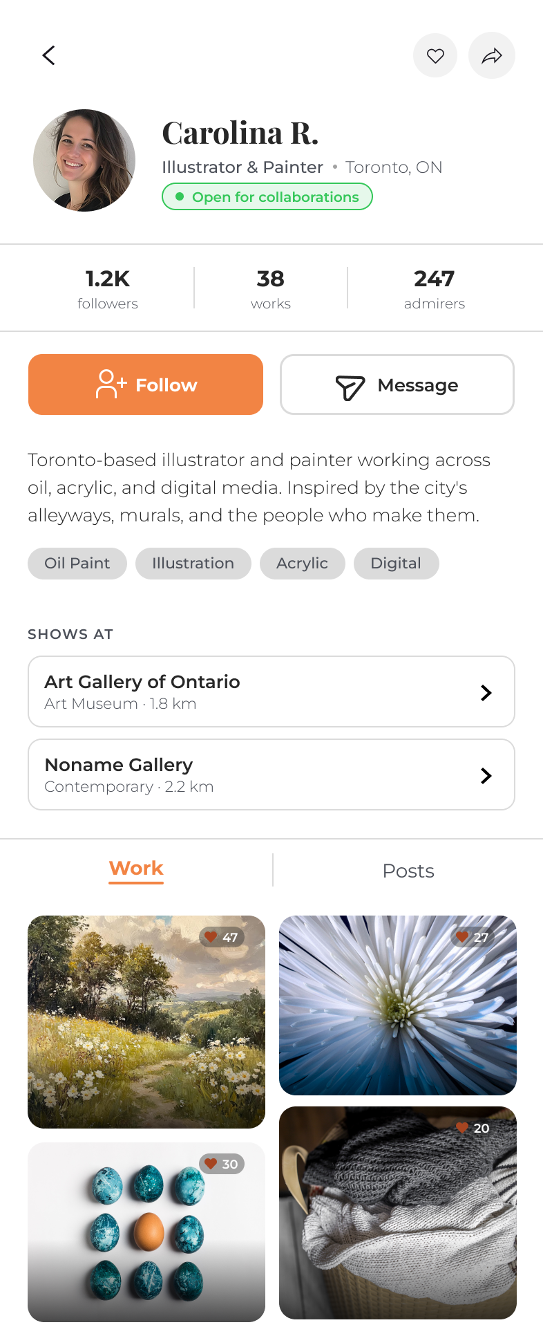
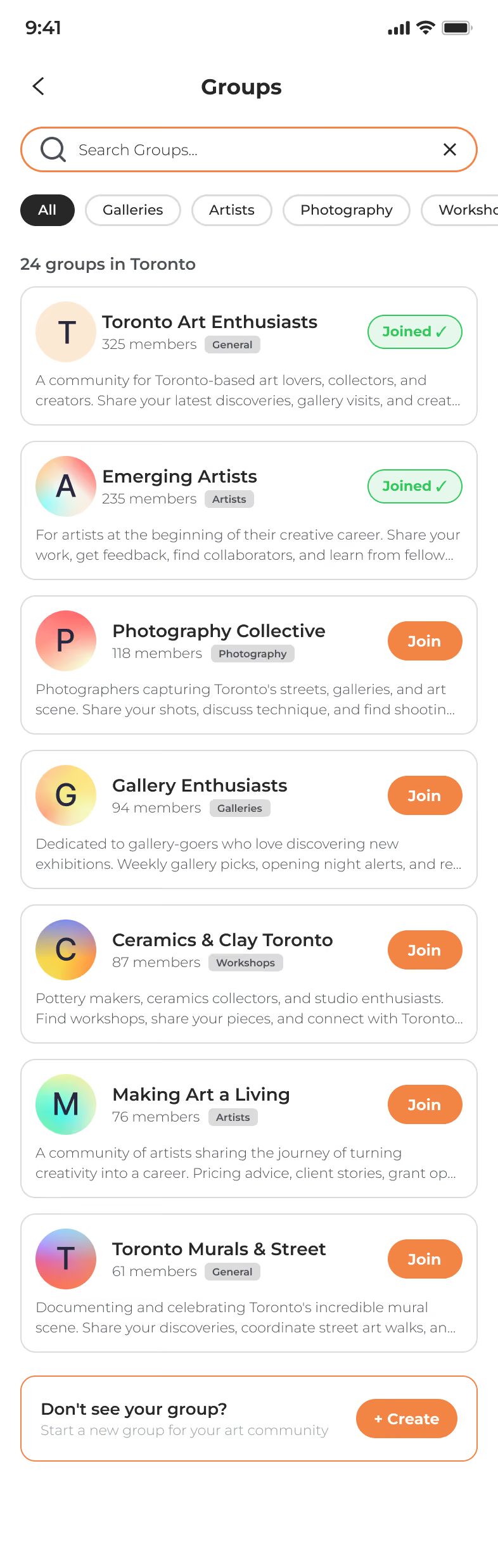
Art-lovers get a place to gather, a shared Community feed and interest groups like Toronto Art Enthusiasts. Creators get their own home: an Artist Dashboard with real analytics, the exact search terms bringing people to their work, and messages from galleries and collectors. One app, two purpose-built experiences.
Design decision: a single "one profile fits all" would fail a two-sided marketplace, so consumers and creators get different surfaces. Impressions, keyword insights, and inbound messages live only on the creator side, because what a visitor needs to explore and what an artist needs to grow are not the same job.

.avif)
.avif)
.avif)
Process
How it actually came together
Artscape didn't come together in a straight line. A token-based design system anchored the visual language, but the sharpest work happened in critique, where a review would change the plan. Three pivots mattered most.
Explore the full design system in Figma →
From a set of screens to a set of journeys
A screen can look finished and still lead nowhere. Wiring the prototype exposed the gaps, Events didn't reach Event Info, and Event Info didn't reach RSVP, and closing them is what finally let Alessandro travel his whole story: listing, to gallery page, to a visitor showing up.

One profile couldn't serve two audiences
A collector and a working artist need different things, so the profile split in two: a Pinterest-style collector page, and an artist dashboard with analytics and messages. The layout itself signals it: exploring a space versus using a tool.

Cutting scope on purpose
Checkout gave way to a simple "I'm Going." And the artist profile lost its Exhibitions tab, since emerging artists like Carolina rarely have, or want, a formal exhibition history. Deciding what not to build kept the product focused.
Design decision: nearly every pivot here made the product smaller or clearer, not bigger. The hardest and most useful calls were the subtractions.