Roles and Responsibilities
We were a team of 5 and collaborate closely with stakeholders to ensure that our final products align with both user needs and business goals. Roles and responsibilities I personally was part of :
Defining user goals, User flow, moodboard, Sketches for mobile and web, Lo-fi prototyping, Mid-fi and high-fi prototyping, interactions, stakeholder presentation, project brief and team coordination.
Problem
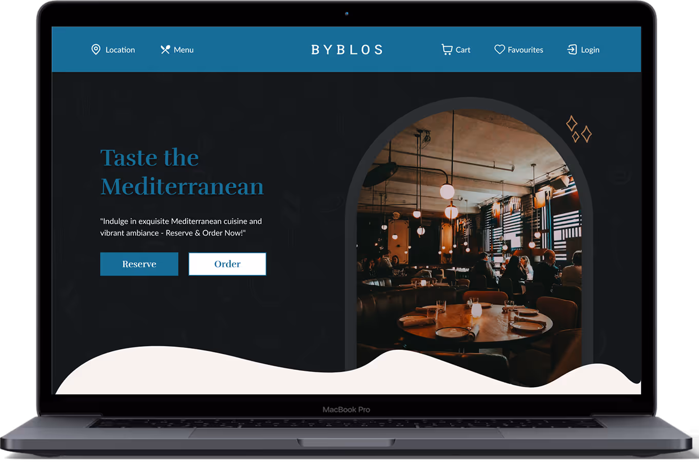
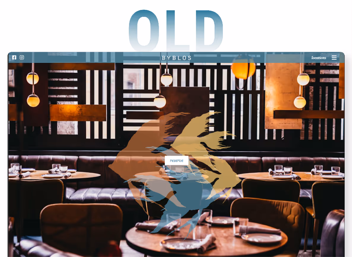
The Byblos website only offered a menu for browsing food items and did not include a feature for ordering food.
What we choose to improve
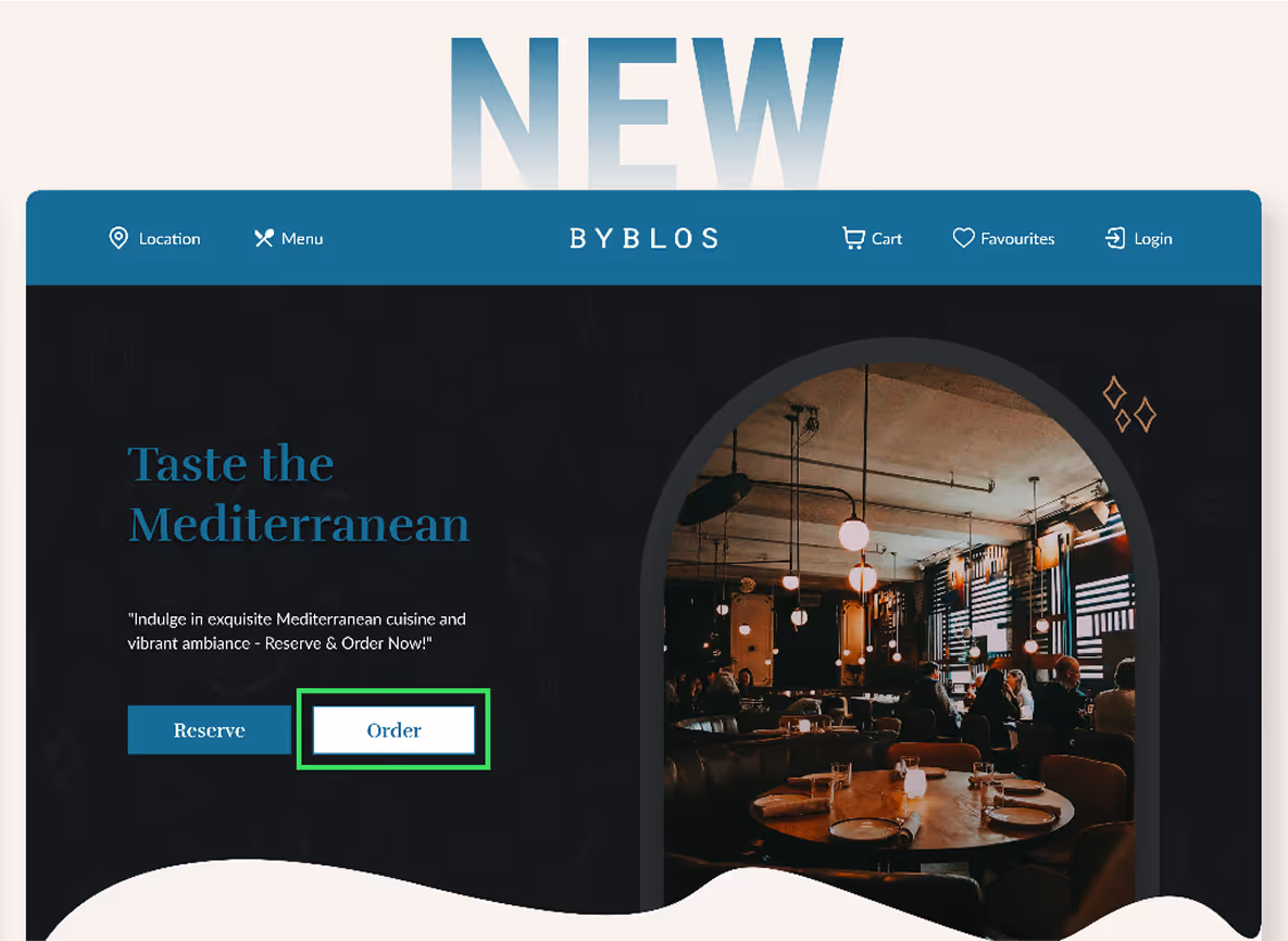
Introduced the order food flow to attract customers to not only browse the menu but also get delivery expereience from the website
Audience
- Locals who frequent the restaurant
- Students who order food for convenience
- Families who order meals together
- Tourists visiting Toronto
Users
Byblos staff and management, including:
- Restaurant managers who oversee daily operations
- Kitchen staff who prepare orders
-Customer service representatives
Constraints
The timeline was short, we completed this project in 6 weeks. These were the additional features that we aimed to add Search, Location options, featured/promo Items, Favourites, order tracking, Chef profiles, revamp of UI of Byblos current website.
Process and What We Did
Our team employed a user-centered design approach, breaking down the process into distinct stages to ensure a seamless and intuitive experience. Here's a step-by-step guide on how we brought this project to life:
User Goals
We started by identifying the users' needs and goals by researching what other Online Food brands are offering e.g Starbucks, TimHorton, UberEats, Doordash uncovering the motivations and pain points that drive their behavior.
Order Tracking
Order Accuracy
Intuitive Navigation
Flexible Payment Options
Quick and Simple Ordering Process
Real-time Updates
Saved Preferences
Transparent Pricing
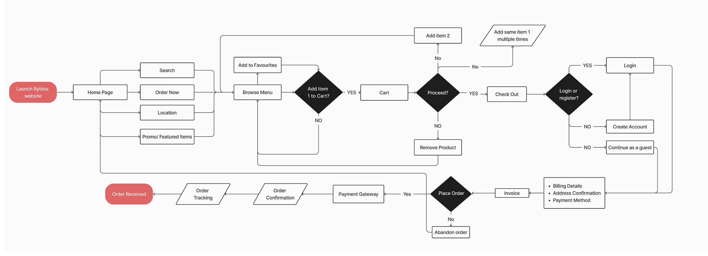
User Flow
We mapped out the user journey, visualising the various touchpoints and interactions that shape their experience. This step helped us identify and focus on the major decision-making milestones during the task flows, ensuring a seamless and intentional user experience.
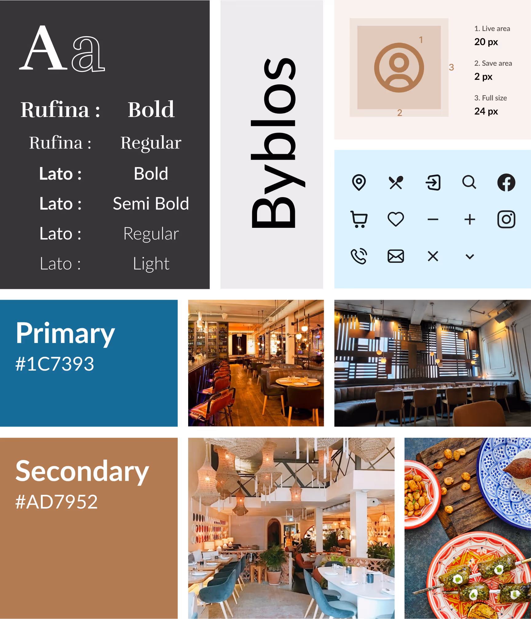
UI Style Guide
We developed a comprehensive UI style guide, outlining the visual design elements, typography, and color palette to ensure consistency throughout the project.
Sketches
We sketched web and mobile interfaces, exploring diverse layouts and interactions. Drawing inspiration from various restaurant websites, we analyzed effective design patterns and adapted them to fit our project's unique needs.
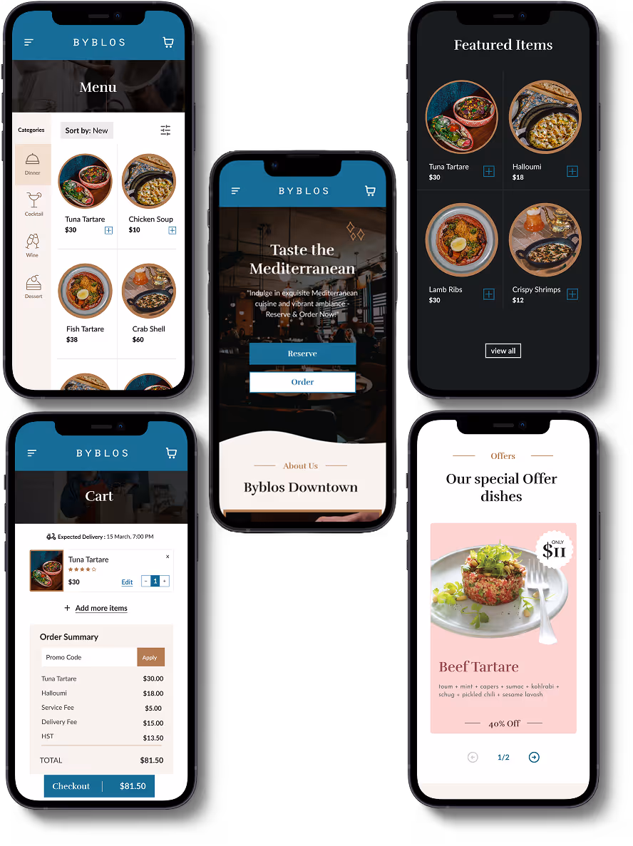
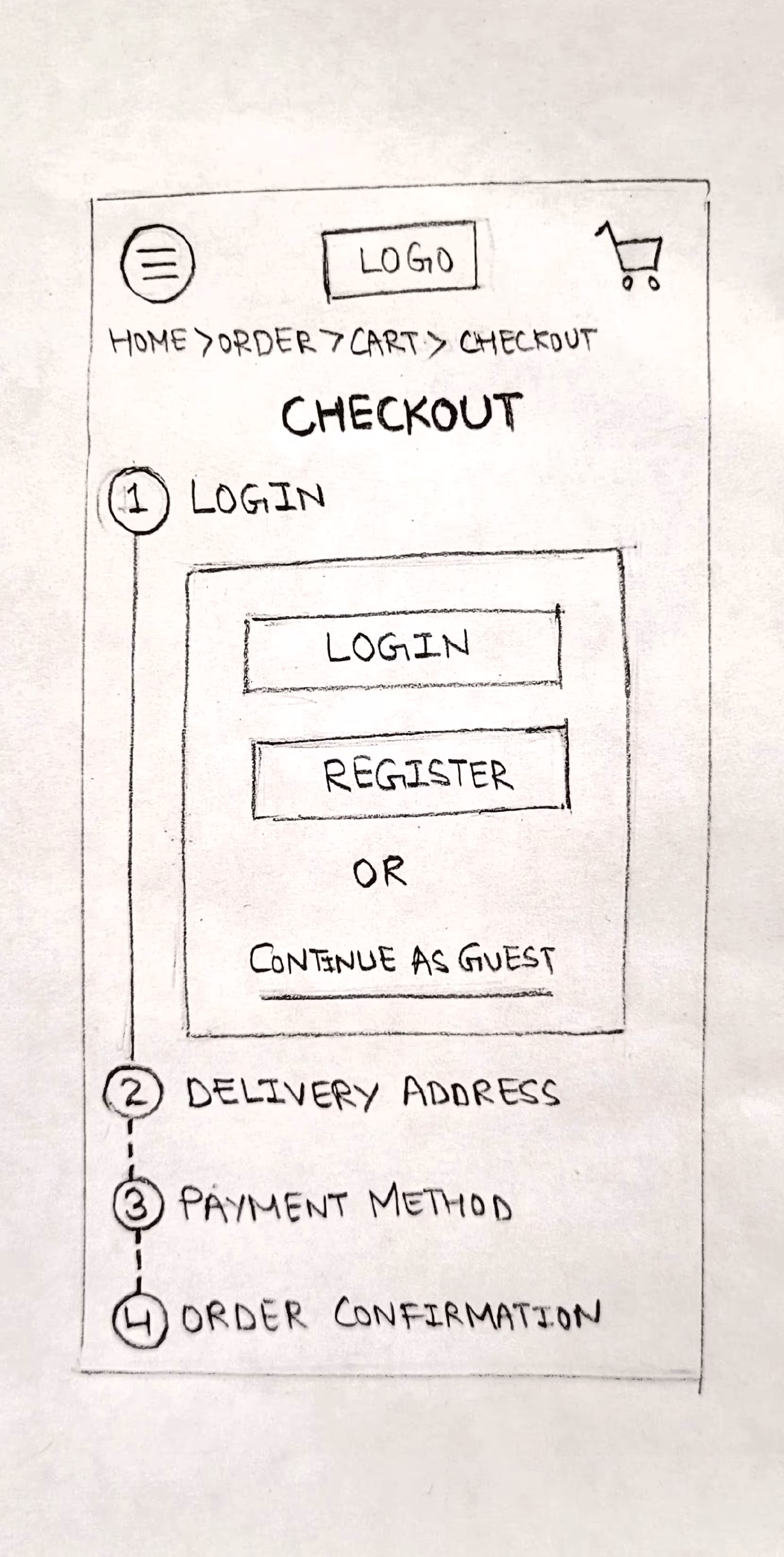
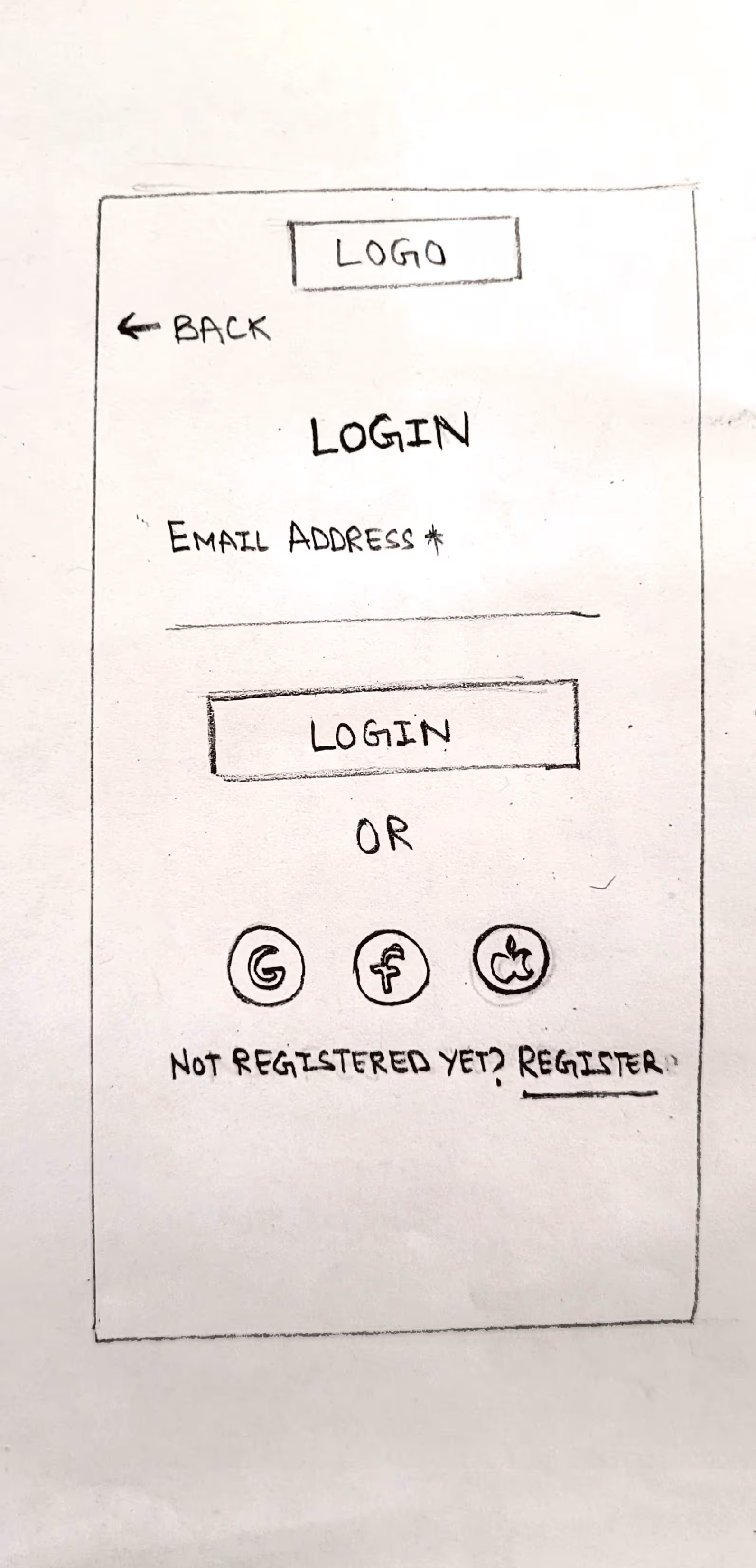
Low-Fi Prototyping
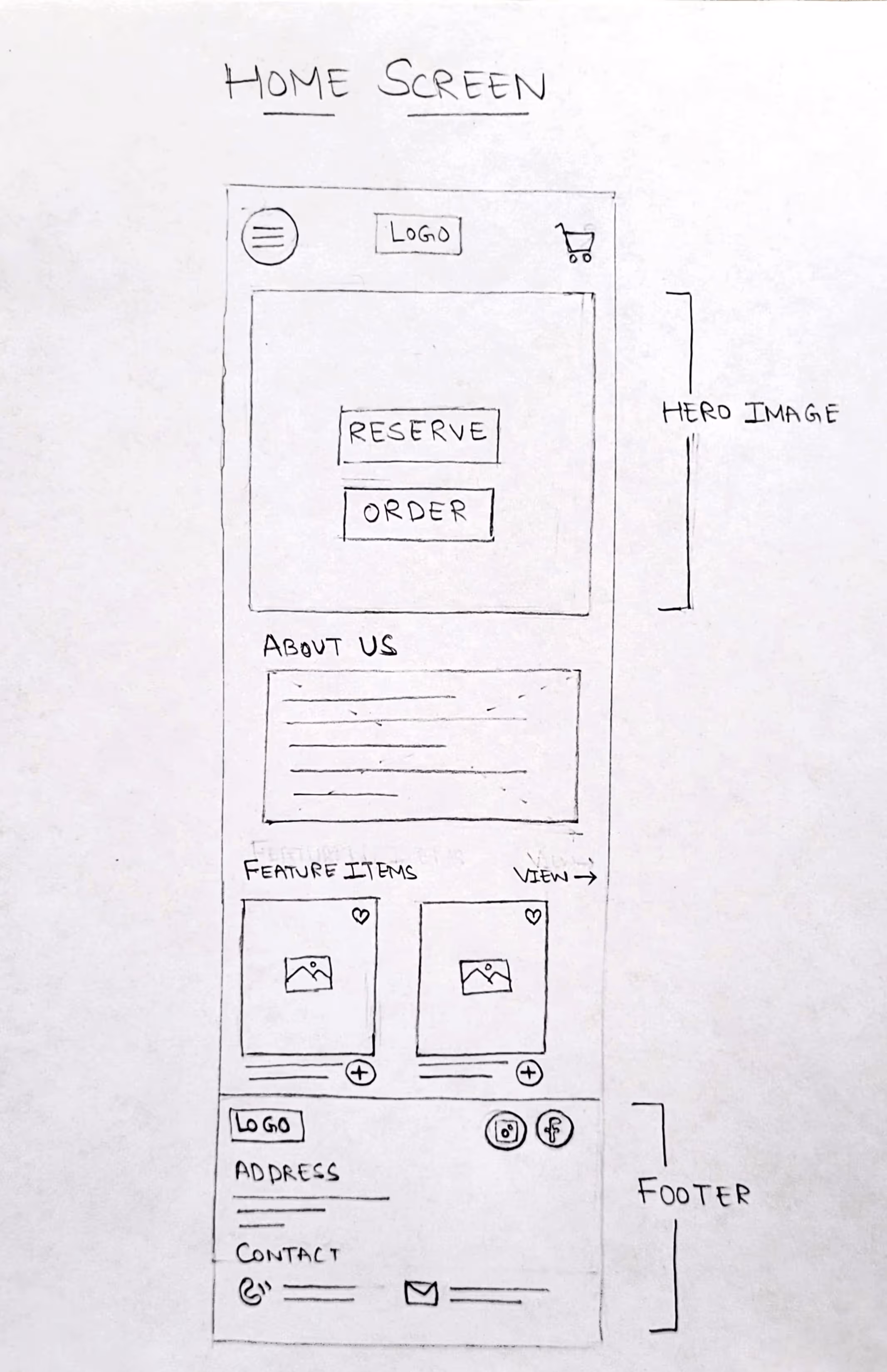
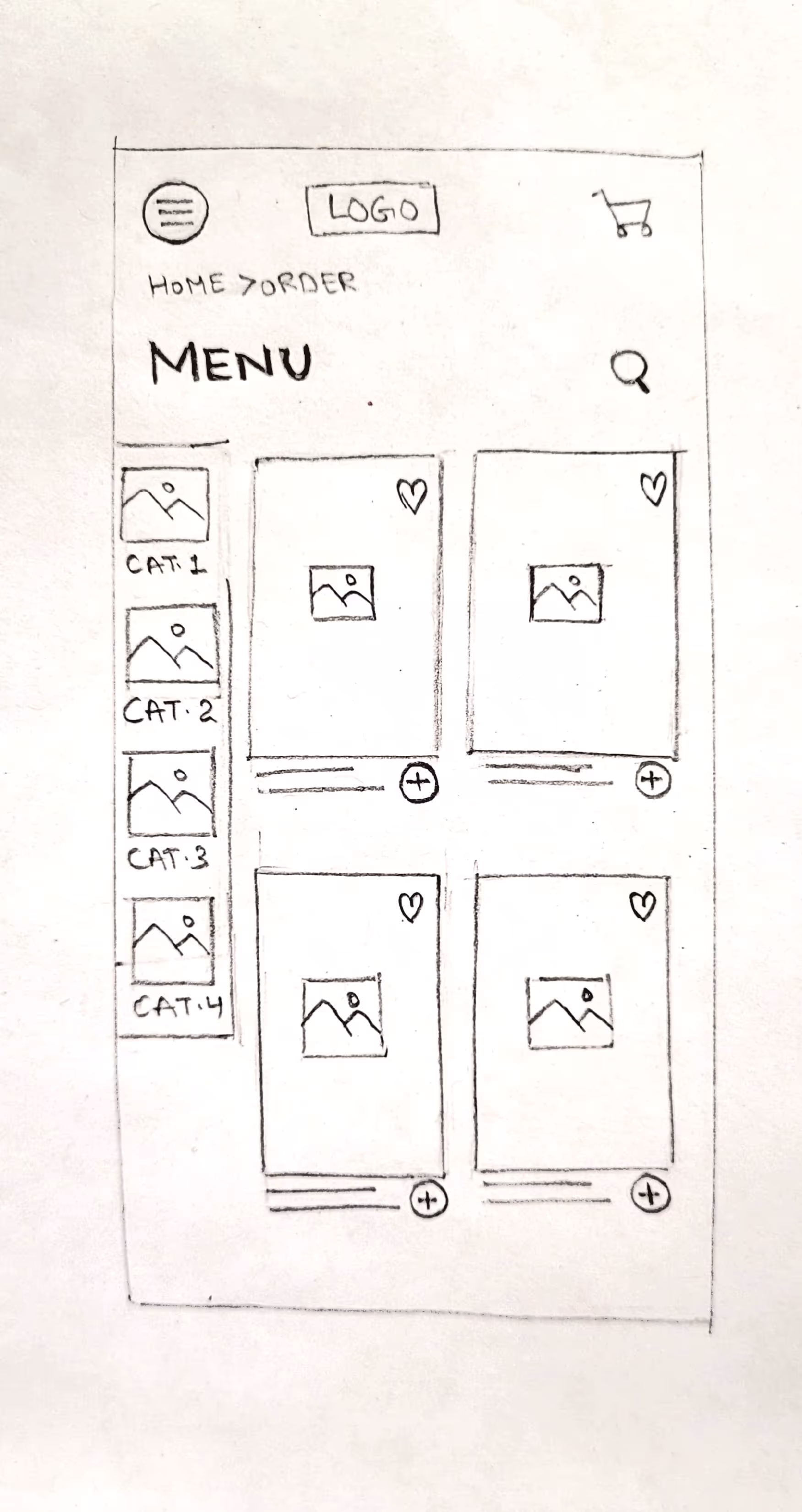
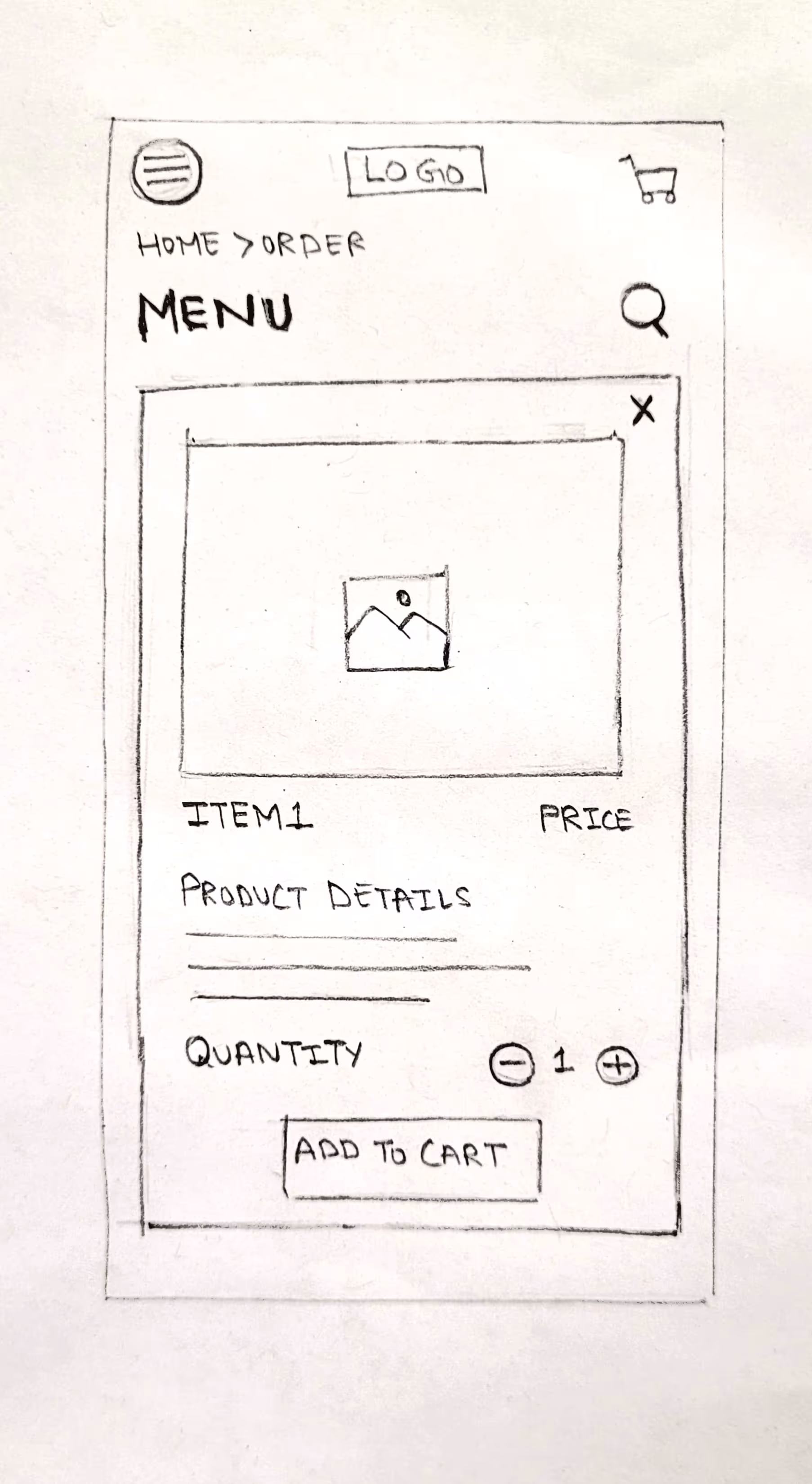
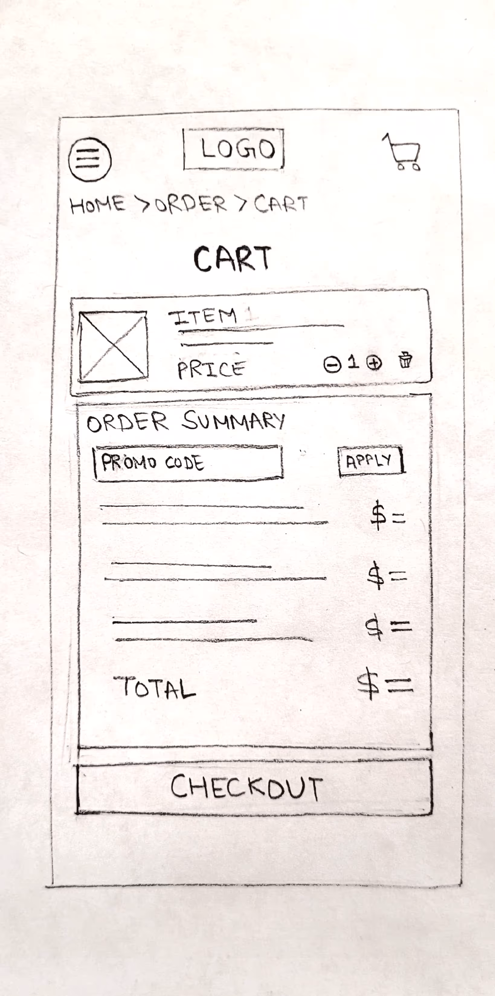
I designed multiple low-fidelity screens, including cart, payment, delivery tracking, menu cards, and product description pages, to test and refine the user experience.
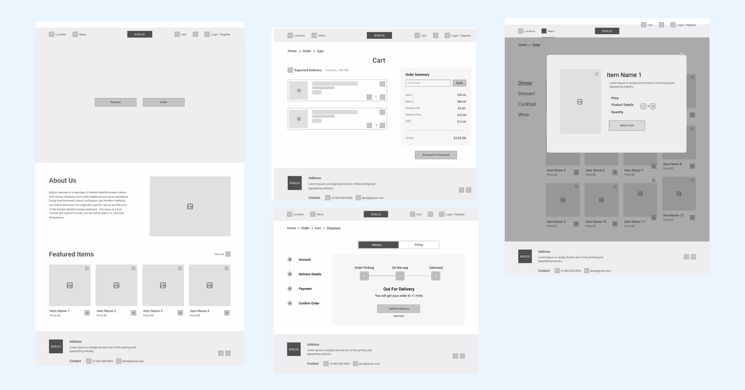
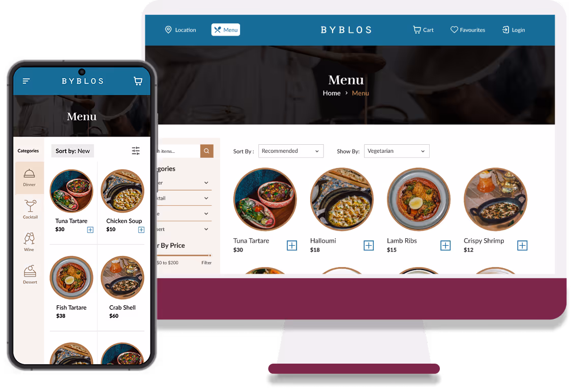
Mid-Fi & High-Fi Prototyping
After completing the low-fi designs, we refined the font sizes and color palette in the UI style guide, then created mid-fidelity and high-fidelity prototypes to showcase the improved user experience and visual design.
Usability Testing and Iterations
Team conducted usability testing on the high-fidelity prototype, gathering valuable feedback, identifying areas for improvement and added features e.g subcategorized menu items, added filters, improved the About Us section etc.
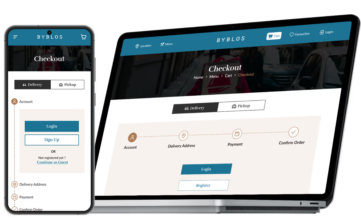
Streamline the process
From selecting items to doorstep delivery, our intuitive system simplified the entire ordering process
Added an option to directly add food items into the cart from menu page
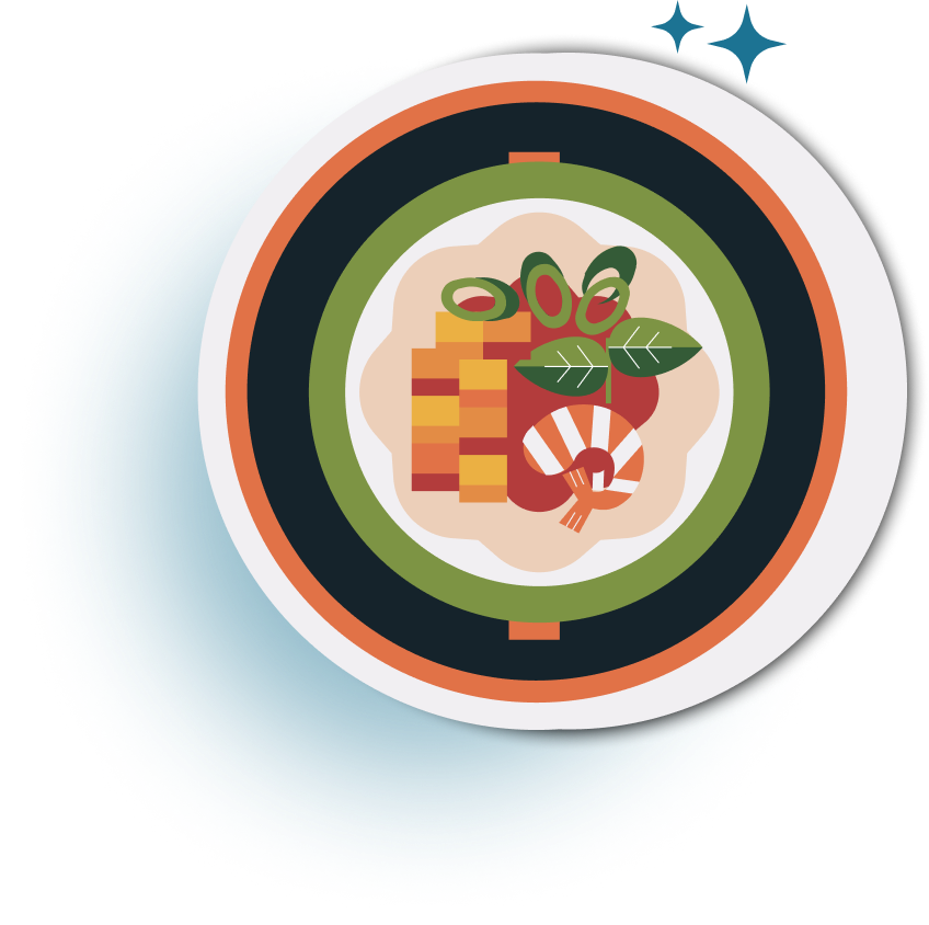
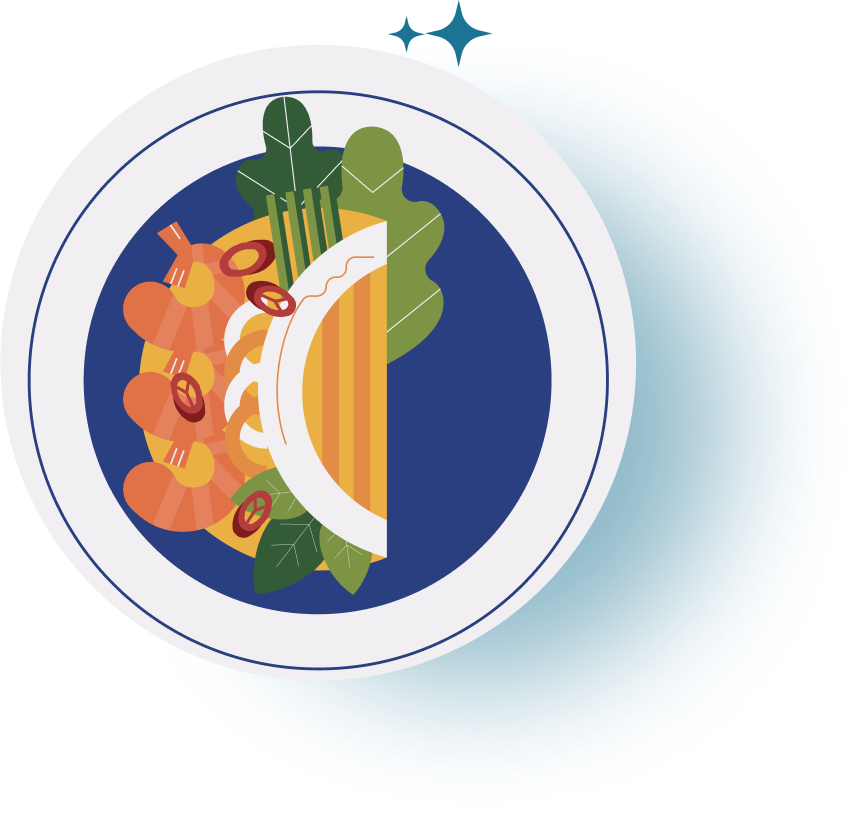
Users can view more details about the dish by clicking on dish name
They also have an option to select between delivery and pickup from the website itself
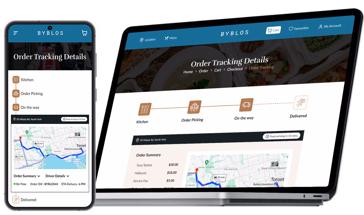
After placing the order, users can track their order from website itself
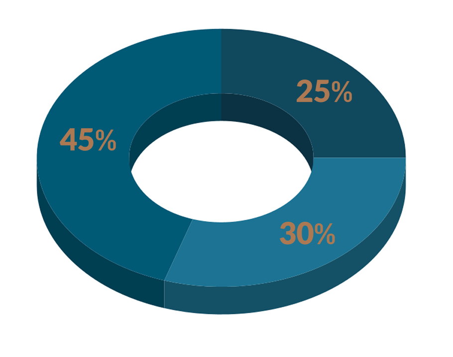
Quantitative Impact
Expanded Customer Base
45% of customers actively engaged with the delivery feature, leading to repeat orders and increased loyalty.
Revenue Surge
Within just 3 months, we witnessed a remarkable 25% increase in online revenue.
Enhance customer engagement
Our seamless delivery integration attracted 30% new customers to Byblos’ online platform.
Outcomes and lesson learned
The final prototype was delivered with all the features that was aimed to achieve. We also did the usability testing, whose findings help us to leverage our designs more efficiently.
- Design for scalability: Ensure the design can accommodate future content and features without major restructuring. For example, the menu page should easily support new categories or tabs as offerings expand.
- Some design decisions totally depend on the testing, what are the preferences of the user got to learn after our assumed design.